info@nautilusmarketing.co.uk
  020 4513 9344


In the digital dynasty we have built this century every company has to engage with technology and develop an online presence in some way, shape or form. Fostering a distinct social media presence is a great way for small startups to gain footing in the industry and a small following to move forward. However, regardless of what the actual product you’re flogging is social media can only get you so far. A fantastic case study to evidence this is Lucy and Yak, once a small sustainable retail startup formed of Lucy, her partner, and her Yak. (Just to make this clear for those not in the know, Yak is to quote ‘the van where it all began’ not an exotic mammal used for propaganda purposes.
Lucy and Chris, her partner, quit the 9-5 rat race back in 2014 and found themselves amount the Kiwis selling handmade pouches made from pre-loved clothes. Moving back to the UK, Lucy and Chris, purchased Yak, loving home, functional transport and portable office, selling vintage clothes online and through pre-unique retail orientated e-commerce sites such as Depop. In 2017, they realised their eye for fashion and partnered with a likeminded manufacture who shared their prerogatives for sustainability, fair trade production, and fair pay. The original 30 pairs sold out on Depop in mere hours.
At this time, Depop is Lucy and Yak’s main if not sole distribution centre while Instagram, Facebook and Twitter are their information, marketing, and promotion points. As a business model this is not a sustainable existence for any company and as the demand for this particular environmentally conscious, comfy, stylish style of fashion and their customer base increased Lucy and Yak needed to carve out a space in the web for themselves entirely branded with the staple Lucy and Yak identity where you can now find a plethora of products, a blog, mission statements, company prerogatives such as anti- racism and all the necessary information anyone could need to, say, write a short case study on the brand… For more on the startup success story of Lucy and Yak click here.
This, of course, is just one example within the infinite wealth of websites currently live on the internet today, over one billion to be exact, that demonstrates the necessity of the website itself in startup success. But there is such a thing, as a bad website. We all know this, no one likes a website bombarding you with adverts and obtrusive pop ups that are the aesthetic equivalent of a nine-year-old girl’s MySpace page with all the navigational sense of a black hole. This is where web design, and good web design for startups at that, is key to the success of a website and, by extension, the startup itself.
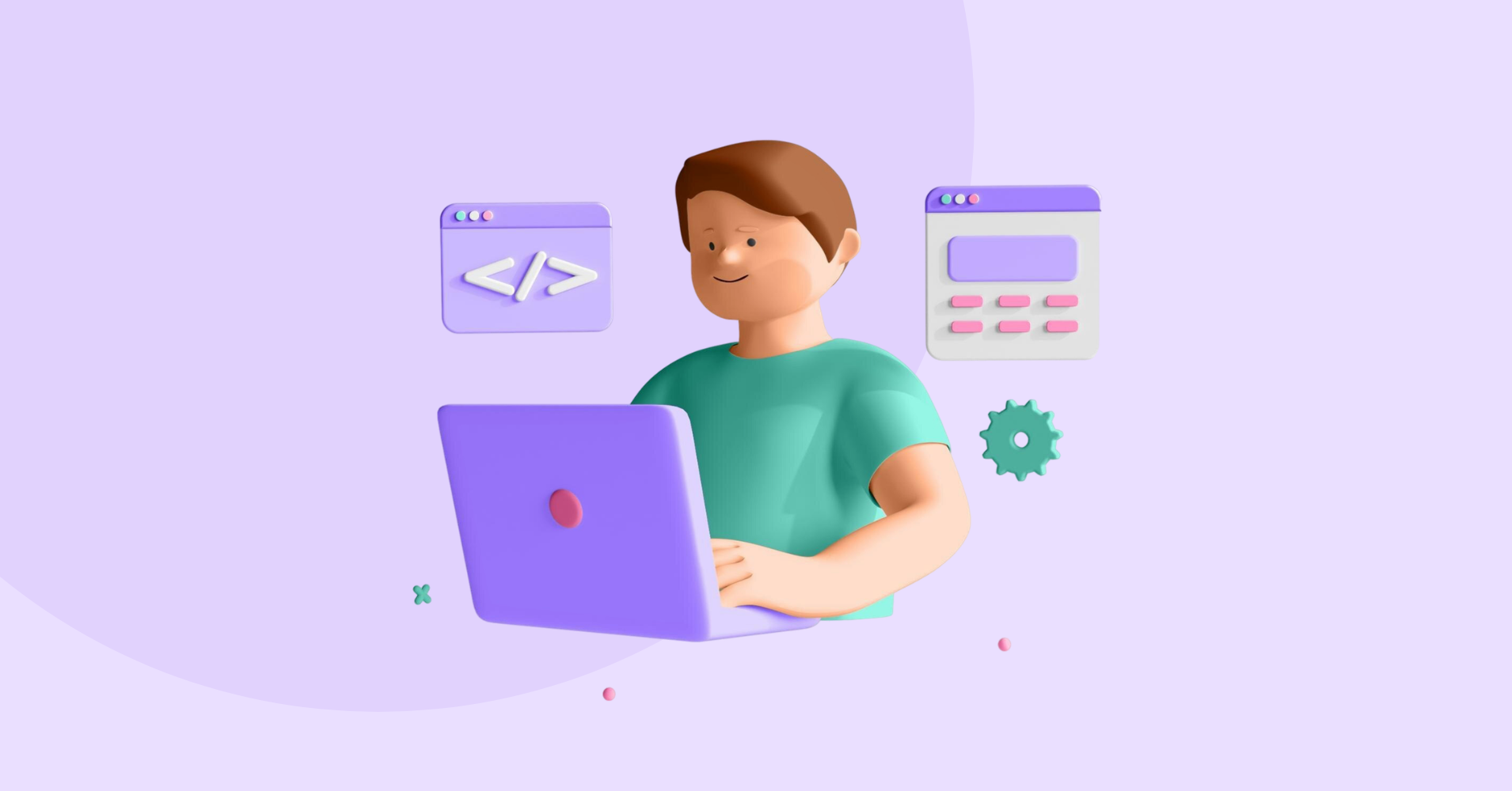
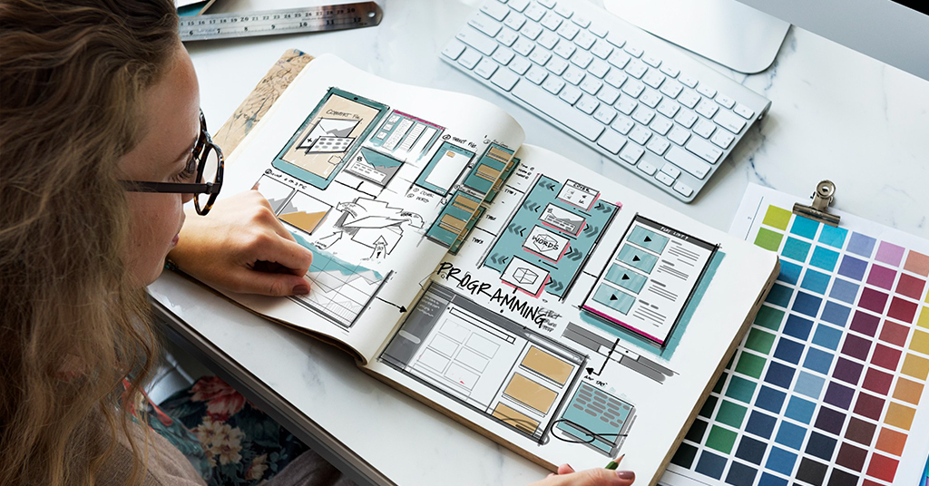
Web design is what it says on the tin, the design, the planning, the arranging of content on a website, that not only allows the startup itself to be shared with the rest of the online world but also that creates space for the startup in the web where the company’s identity can breathe and grow. Now certified web designers are the ones with the academic know-how when it comes to the technological nitty gritty such as SEO (Search Engine Optimisation) and securing the domain itself. But to get you started, there are some fantastic website builders out there such as WordPress and Wix which are great first stepping stones for creating an initial online presence through a dedicated unique website. For this or similar websites for startups you will need to concentrate on two fundamental prongs of web design for startups: Aesthetics, and Functionality, and we’ll break these down for you into their vital components in what will be the perfect guide for any budding entrepreneurs.
Aesthetics
Now, Aesthetics as most will recognise, refers to the ‘look’ of a website, we’re talking colours, fonts, graphics, user interface, essentially what your customers are going to immediately see when they click on your website; and, when it comes to the aesthetics of web design… there are some recommended dos and don’ts.
If you’re the kind of person who lives in dark mode on all your devices, your poor eyes have been straining much harder than the rest of us who prefer light and bright. According to recent research by psychologists, Piepenbrock and Mayr, when we look at a bright background, our pupils constrict and our ability to absorb the information on screen is increased. When looking at a dark background, the opposite effect occurs meaning the legibility of the text and thereby the entire content of your website is not being absorbed. Remember the mantra: get it right, black on white!
Equally, font and typeface are key, and not to be confused. Font refers to the form of the text, whether it’s in bold, italicised or underlined, whereas typeface refers to the style or type of text such as the old faithful’s, Comic Sans, Times New Roman, or Garamond. However, it’s an unspoken rule that, while sans serif fonts, such as Helvetica, are generally preferred for clarity and legibility on-screen, they are also associated more with technology, digital, or STEM based business and websites. While serif fonts, such as Times New Roman, tend to be associated with creative, old- school journalism, arts and humanities-based businesses, bearing in mind that Times New Roman was initially created for The Times newspaper. You may even get quirky and use cursive typefaces if that fits your startup’s identity but keep in mind to prioritise clarity for large blocks of text and perhaps save a highly stylised cursive typeface for headers and logos. Given these unspoken associations this may be something to consider, and whichever typeface you do decide to define your startup’s identity, you need to be consistent.
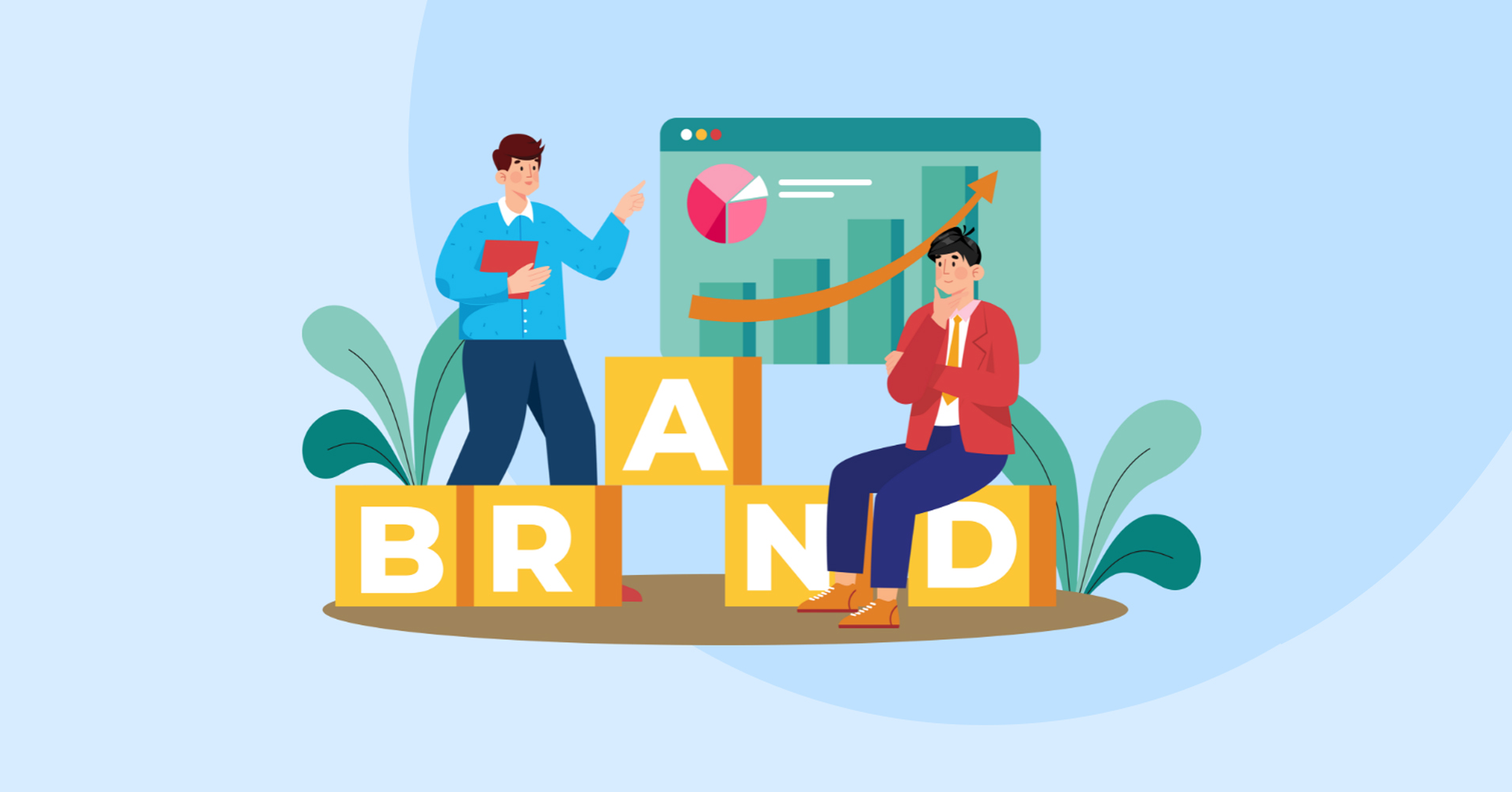
This leads us nicely into a discussion of identity, remember, websites are an increasingly large part of a business’s identity, and, as a startup, it’s incredibly important to lock exactly what your company is about down clearly for your audience. Well-placed, relevant graphics are useful to make your website exciting and visually demonstrate exactly what your startup is about. Clean Beauty startup, Saie, founded in 2019, is listed as one of the fastest growing startups to watch in 2024; their website is at least 70% graphics over text but every visual is essential and relevant to their brand.
On the flip side of this, irrelevant or obtrusive pop ups can be a dealbreaker for visitors to your website. Love-bombing in new relationships is no turn-on and bombing your customers with unnecessary add-one’s, adverts, and obtrusive pop ups begging them to ‘sign up to our newsletter’ is a sure-fire way to deter a good portion of your new clientele when they arrive new to your website. Cookie notification is necessary due to current legislation but covering the screen or corrupting the perceived legitimacy of your website with unrelated, “dodgy” adverts, however much they might pad your bottom line, is a definite don’t.
Finally, your mission statement, or purpose needs to be abundantly clear with the web design of your startup: what are you and your company about? Why are you important? Why should the customer choose you? Remember every company has a product that the customer needs to need in order for it to succeed. Whether this is displayed verbatim in an ‘our mission’ subheading, implied through a site blog or evidenced sub-textually in the wider visual aesthetics of your website.
Functionality

Now that we’ve dealt with the ‘what will it look like’ portion of the outfit, we need to tackle your website’s design functionality. For the purposes of this simple but comprehensive guide we won’t be diving into the pitfalls of poor SEO, or how to integrate HTML and CSS to generate perfect web design layouts. But we will be exploring the importance of functional layouts and basic navigational principles to create the perfect first web design for your startup.
To allegorise web design into a simpler concept it’s essentially a map of Middle Earth, complicated nonsense to the layman but to a cartographer or someone with the equipped smarts an entire world. This guide will allow you to become equipped the right smarts and tools to fashion your own maps where X marks the spot to your product and ergo your profit.
However, without recognisable markings and features that are essential for you to navigate using the map it is completely useless. Website builders will tend to offer tutorials and templates using known paradigms for web design layouts; key aspects of these will include simplified contact information immediately visible, usually in the top right of the screen, with the logo either at the top left or middle of the page. A navigation menu using row of headers or a menu icon clearly visible which, when clicked, displays the necessary headers to navigate the site successfully, breaking down pages into sensible categories. Some sites may incorporate a search bar, clearly visible, and most likely a site map at the bottom of the site, linking to the most important information and, crucially, social media links.
Referring back to our original case study Lucy and Yak, we can see that their website doesn’t necessarily follow all the navigational features included in the above “template” however, it does incorporate a recognisable web design using easily identifiable icons to make the functionality of the website easy and simple for even the most avid technophobes to navigate. Firstly, the site loads immediately, it sounds obvious however, studies show that the majority of visitors will abandon a website if it takes longer than three seconds to load so make sure to organise a hefty bandwidth to power your website if it’s very media heavy. Secondly, the navigation headers, ‘shop’, ‘about us’, ‘help’, ‘our stores’, are clearly visible in the top left corner of the site, with an embedded drop-down menu for the customers to navigate the ‘shop’ and browse the website’s products, and by clicking on the ‘Lucy and Yak’ logo you are returned back to the homepage. By scrolling down on the homepage, you will not only find new featured products, but can evidence their prerogative of sustainable fashion materials, sign up to their newsletter, and view an embedded sneak peek of their Instagram social. At the very bottom we have a clear, well-structured site map complete with relevant headers, ‘help’, ‘for you’, ‘about us’, ‘legal’ containing all the essential information for any visitors to the site whether customer, journalist, or collaborator, alongside social media icons linking to their pages.
From this example, though in 2024 their original web design will have advanced significantly, we can observe and understand the fundamental importance of using recognisable navigation layouts, tools, and icons for the layman, and of course, if a user can access your site and navigate successfully their far more likely to come back having had a positive experience than if they get lost on their travels. When considering websites it is a useful point of research to have a look at web builders if you’re low on funds, helpfully however, there are certified web designers who specialise in websites for startups, such as ourselves, know their stuff and will often bring a whole host of knowledge to the procesds. Hopefully, if you’re new entrepreneurs with a viable startup this guide will have provided some helpful information to get your footing within the online world.